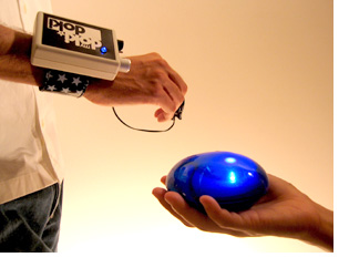
The my doki-doki project was created by myself and colleagues James Milward and Trevor Shaikin back in 2005 when we were residents at the CFC New Media Lab. From the original project page:
The concept behind my doki-doki is to enable you to see and feel your heartbeat and share the experience with others. By providing a visceral expression of your heartbeat, my doki-doki creates a new kind of self-awareness and a unique opportunity to connect with others.
The current prototype takes the form of a translucent bean-shaped orb that is an externalization of the heart itself. A soft glow and a gentle vibration undulates through the unit in time with the beating of your heart. Your heart rate is measured in real time through a sensor placed on the tip of your finger, and wirelessly sent to the orb from a wrist-mounted transmitter.
Amusingly (in retrospect), the text goes on to attempt some utilitarian justifications for the project:
Future incarnations of my doki-doki could easily transmit the heartbeat through the internet or cellular network. This could be used, for instance, to allow long-distance lovers to maintain a deeper connection while apart, or to allow you to feel an athlete’s heart pound as he or she tears across the finish line.
While it is quite possible that the object could be used for these purposes, I’m pretty sure (if memory serves) that those ideas came about after the fact, after we’d already designed it and built the prototype, and probably because many people we showed it to at the time had a similar reaction to it: “Yes, that’s cool… but what’s it for?” Faced with this incessant line of questioning, I recall feeling quite a sense of pressure to come up with some good answers.
These days I would respond to that question quite differently. It isn’t for anything, except your enjoyment (or your horror), and to provide you with a novel experience, and maybe to get you thinking about playful technological possibilities. It is perhaps a work of discursive design – “as a category of product design that treats artifacts principally as transmitters of substantive ideas, rather than as mere instruments of utility” – or ludic design, a term attributed to design scholar Bill Gaver, who describes it as “a nice alternative to assumptions that design should be about problem solving or about functionality or about trying to … pursue tasks in particular ways.”
my doki doki (2005 IAEP Prototype) from CFC Media Lab on Vimeo
In this paper, Gaver et al elaborate on what it might mean to design for “ludic rather than utilitarian activities”, suggesting that ludic designs should “promote curiosity, exploration and reflection”, “de-emphasise the pursuit of external goals”, and “maintain openness and ambiguity: … avoid clear narratives of use…”. These statements very much capture the spirit of my doki-doki as I now see it – much more so than “allowing long-distance lovers to maintain a deeper connection while apart”. That it avoids a prescription for use is a strength rather than a weakness.

